Origins
At the end of 2022, I had finished a reboot of my first personal site. However, after looking back, I noticed the site looked awfully ugly. The colors hardly matched, the UI felt off, and overall it lacked professional polish.
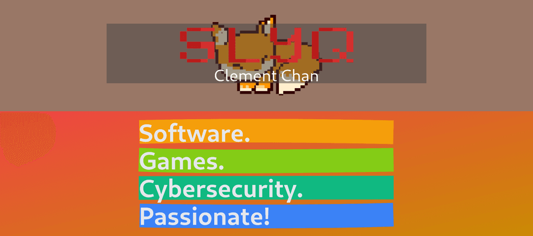
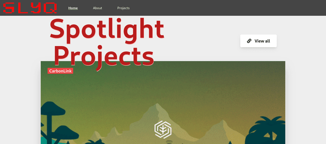
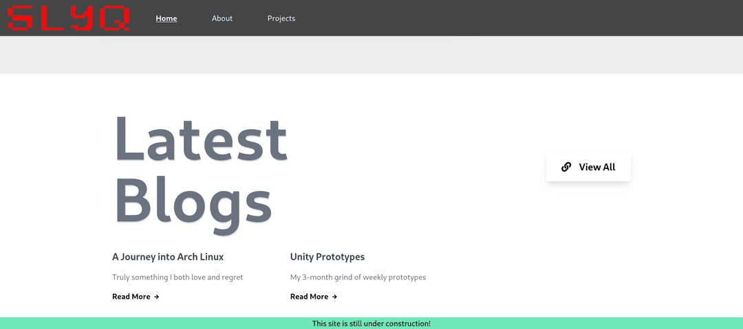
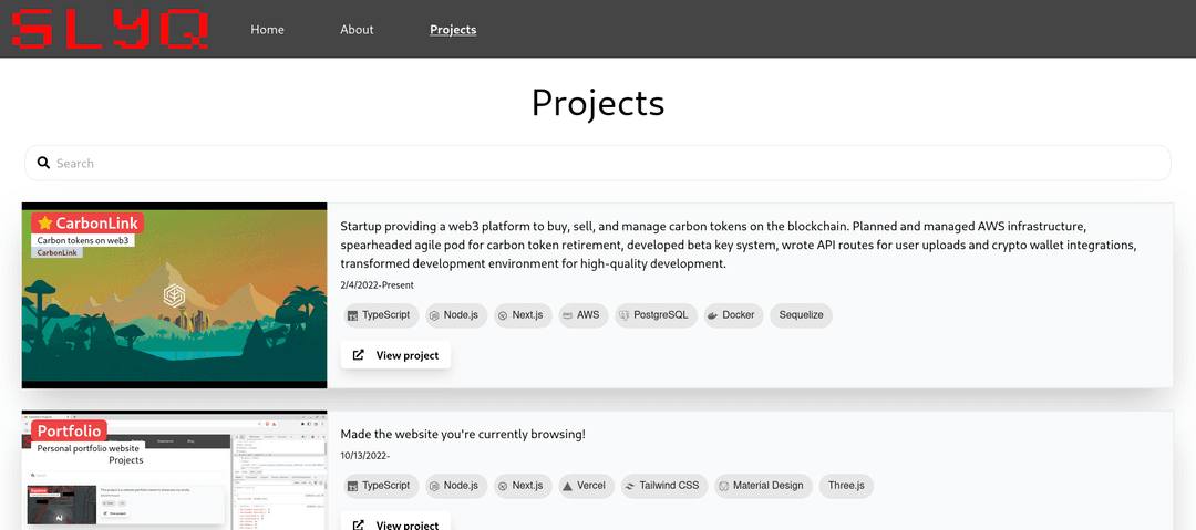
Unsatisfied with my work, I decided to start over from scratch. This time, I wanted to focus on UI design BEFORE development. I wanted to make a site that looked cool and mobile-friendly, and I wanted to strike a balance between artistic feel and readability.
This also gave me a chance to learn Figma, try out NextJS 13's new app directory, and practice more frontend development with TailwindCSS and RadixUI. I also wanted to make a blog section so I could write about my projects, experiences, and anything else.
Determined to make a site I could be proud of, I started prototyping the design on Figma in early 2023.
Design
It was clear from my previous website that I should stick to a cohesive theme with colors that mix well together. So, the first thing I did was choose a color palette. I discovered coolors, a website that helps generate color palettes, and I mixed in some inspiration from Koraidon, a Pokemon from the game Pokemon Scarlet and Violet, which I had just finished playing at the time.
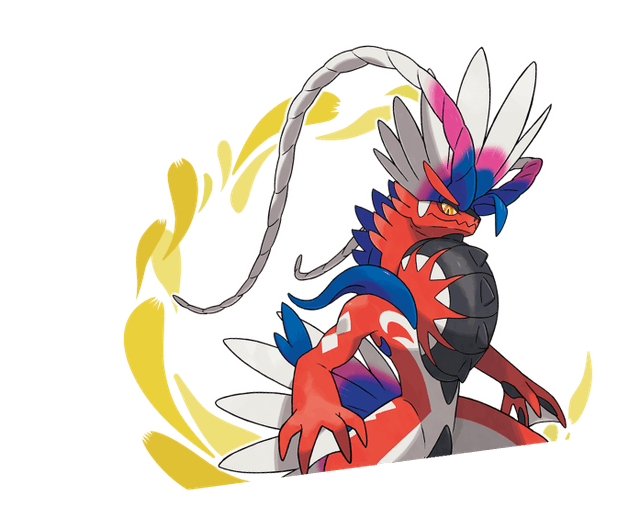
Koraidon
I particularly liked the mashup of red, black, and white with the gold and blueish accents, so I used some similar colors throughout the website. In the end, I ended up sticking with these colors:
Next, it was time to begin designing. I looked at various portfolio sites for some inspiration, and I eventually decided to go with a simple, clean home page design with a slick transition animation.
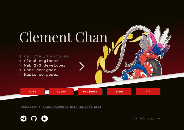
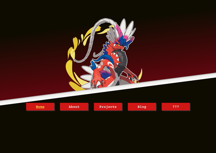
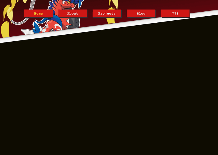
Having the navbar slide around didn't make sense with hamburger menus, so I avoided having an animation entirely on mobile.
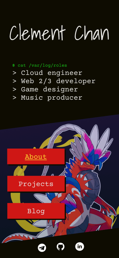
After fleshing out the About and Projects page, I asked a good friend of mine who's an expert in frontend development for some feedback. Following his advice and some more iterations, I finalized my design and was ready to begin development.
Development
Around May 2023, I created a new NextJS project and decided to try out the new app directory structure that had recently rolled out. It took a bit to get used to, but I understand the reasons behind separating client and server components.
Blog
I started with the blog section since I knew it would be the hardest. For the blog, I had two main goals:
- Be able to write new posts easily (because who wants to write in raw HTML?)
- Have enough flexibility for complex posts
To achieve these two, I decided to make use of MDX, which would allow me to write in Markdown but inject custom parsers and React components. The default MDX configuration wasn't as powerful as I wanted it to be, so I followed their guides to add support for GitHub-flavored markdown, LaTeX, and syntax highlighting for code blocks. For the most part, extending was as easy as installing a package and adding it to the MDX options during compilation. I also made a component to easily inject NextJS images. Already, I had a pretty solid blog writing pipeline set up.
While developing blog features, I came across a deceivingly simple problem. I wanted to add a copy button for the code blocks so that it would be easy to copy code snippets. Turns out, determining the text to copy was a bit complicated due to the syntax highlighting plugin. Luckily, another blogger had the exact same problem, and I was able to borrow parts of their solution. In the end, I made a custom rehype plugin that, when encountering code blocks while walking through the MDX AST tree, would capture the needed text in a "safe" HTML property that wouldn't be modified by the syntax highlighter but would still be accessible to the copy button component.
Home Page
With the blog framework finished, the next thing up was the navbar and home page.
The navbar animation took at least a week (during my free time) to perfect, but getting it right felt super satisfying.
I used a mix of animated skews, absolute position translations, and overflow-hidden to achieve the effect of having the home page hero image slide to the left behind the simultaneously rising white bar.
I also adapted an idea from another blog to make 3D navbar buttons that would pop out when you hover over them (sorry mobile users, you don't get to see).
About and Projects
All that was left afterward was the About and Projects page.
The About page barely required any work - I used RadixUI's Accordion component to make a high-quality expandable list of my experiences.
For the Projects page, I wanted to be able to filter projects by field, work type, and skills, so I utilized RadixUI's radio and toggle groups and the react-select package while supplying my custom styles to preserve a consistent theme.
Miscellaneous
I also added a few other features to the site after receiving extra feedback from my friends and coworkers:
- Search parameters so I can send a link to a pre-filtered Projects page
- A spotlight on the home page that really stands out
- Accessibility for navigation by tabs
- A bunch of other super minor details
Takeaways
After nearly a year of on-and-off work, I feel like I can say that I've finally "finished" my new portfolio site. The journey was long, but I learned a lot along the way. Here are just a couple of the things I realized:
- Flexbox isn't actually that hard, it just takes practice
- DESIGN BEFORE IMPLEMENTATION (Figma is based)
- Red+black+white might not actually be my vibe (but it's not bad either)
- I recognize my weakness in writing and blog throughput, and I'm aiming to improve